I'm a designer specializing in User Experience and digital branding.
I'm a graphic designer born in New Jersey, raised in Pennsylvania, and settled in New Hampshire. I grew up glued to that brick we called our family computer, and needless to say, the addiction to tech has been with me ever since.
Over my 7+ years of web experience I've spearheaded website rebrands, dove into UX research to make data-supported and user-approved site improvements, became an accessibility advocate, and created collateral for marketing campaigns of all stripes (web, print, email, pick your poison).
In my spare time I'm a hiker, painter, gamer, and cat dad. You can find me in any cafe up and down the New Hampshire seacoast, or on a trail in the white mountains with my wife.
Download my Resume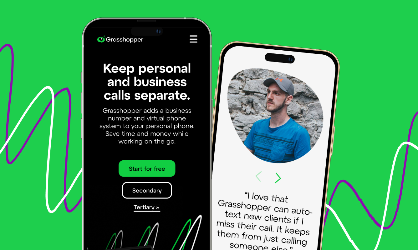
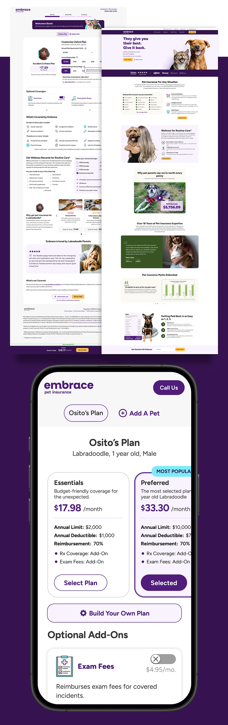
The Challenge Embrace entered 2020 with a massive boost in brand visibility and consumer interest in pet insurance, due to unprecedented growth in pet adoption and ownership. With that visibility, Embrace had to asynchronously update their branding and website to keep with modern trends and web accessibility standards.
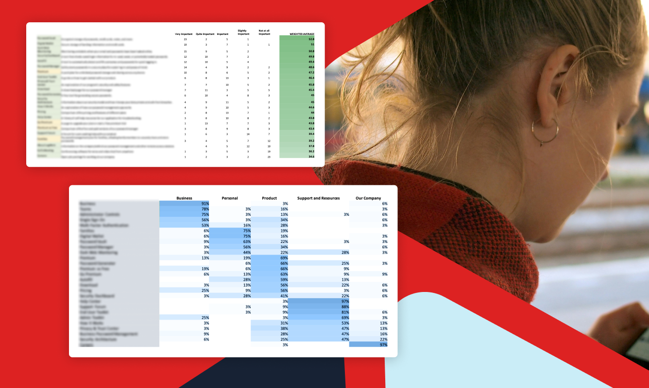
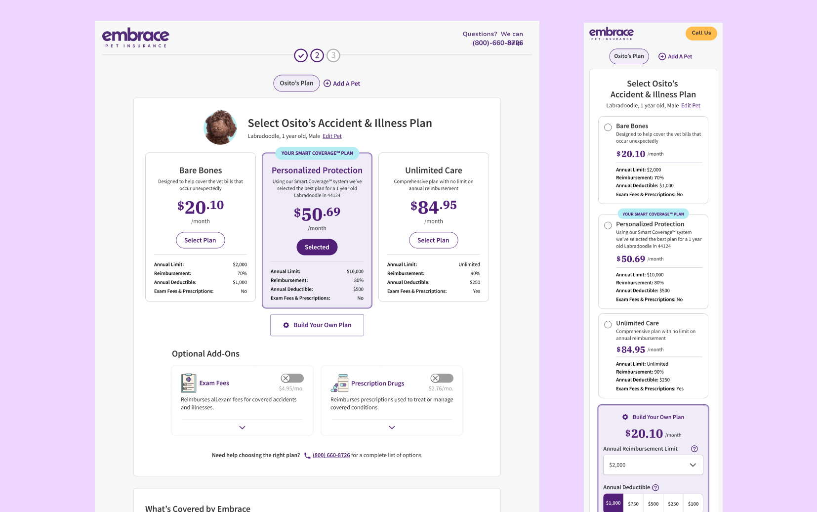
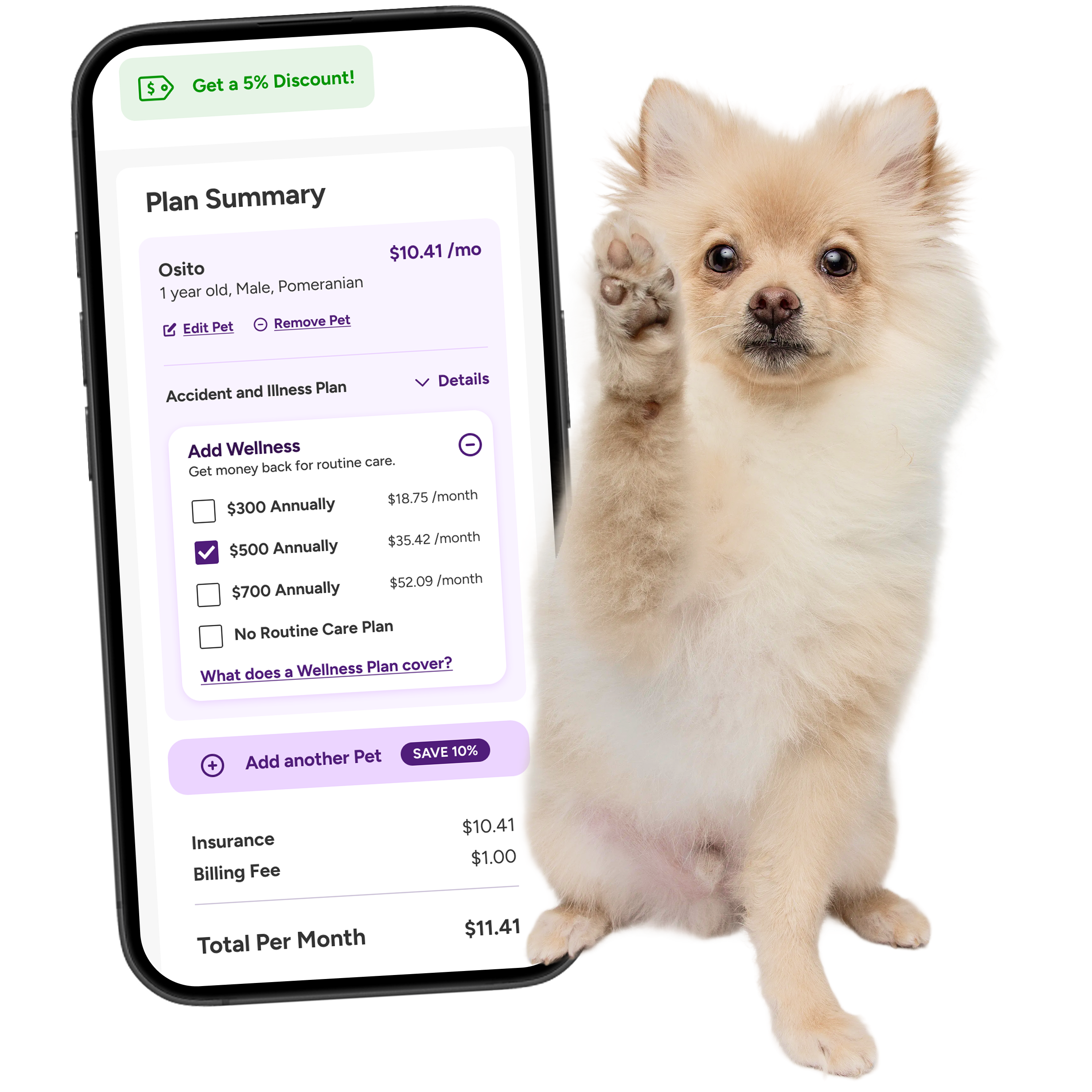
The Solution Working with the marketing, UX, and IT teams, I collaborated on a year long AB Testing schedule to help the Conversion Rate Optimization team. Much of this involved work on Embrace's Quote Engine, which contributes to the majority of its sales. By studying direct competitors, as well as insurance industry leaders, we began to build a future vision for Embrace's online presence with modernized branding and web enhancements that enabled a frictionless experience from quote to purchase, boosting CVR by 1.5% and monthly insurance premium by 14%.
Read the case study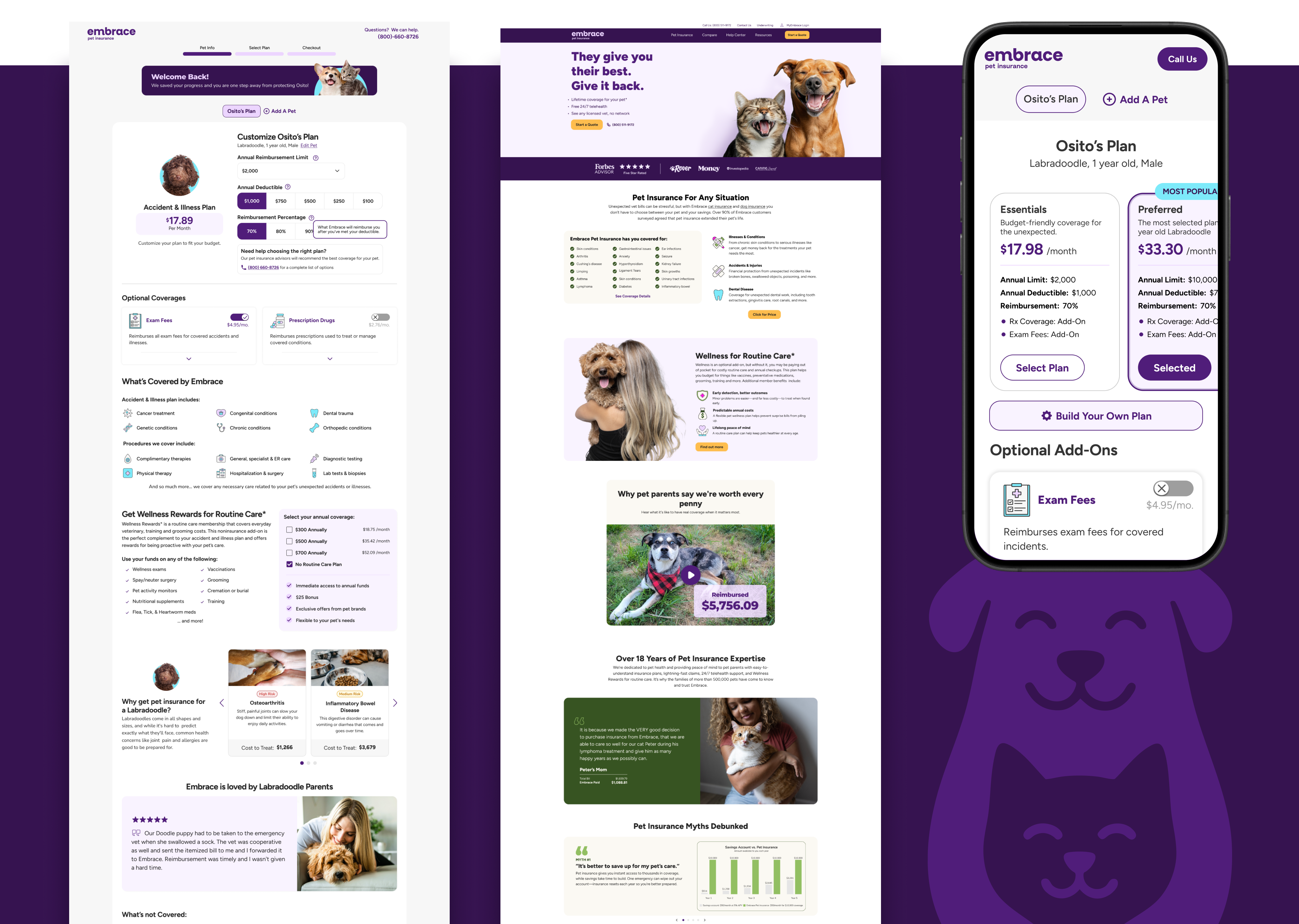
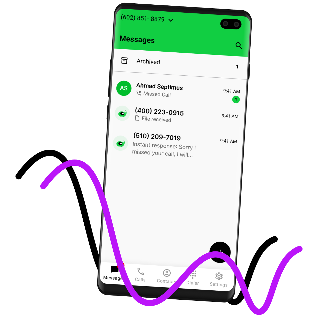
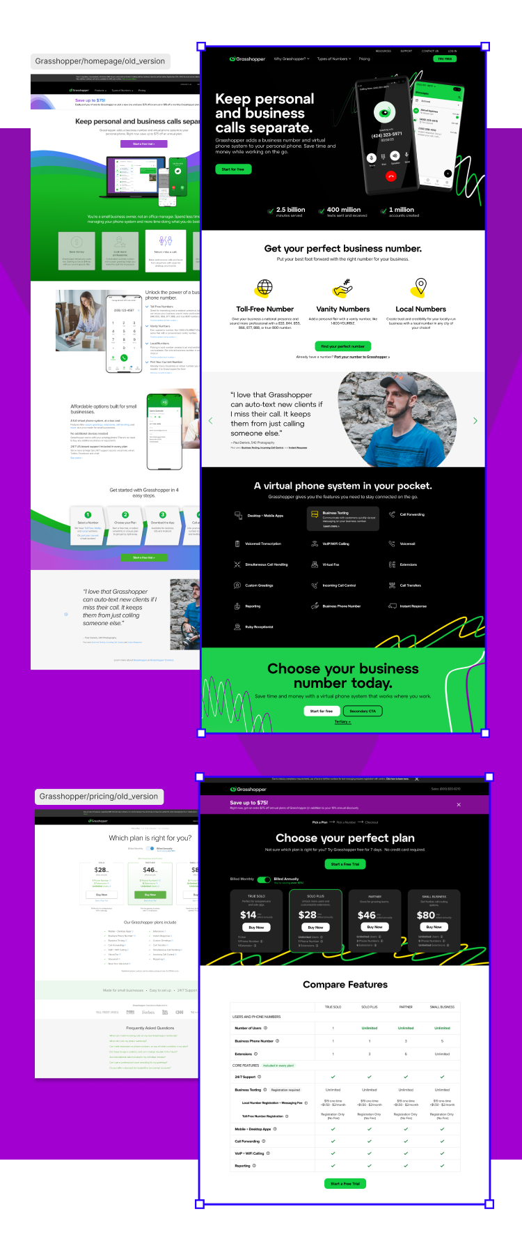
The Challenge Grasshopper as a product has remained one of the most affordable VOIP phone solutions on the market, but struggled to grow itself into a more modern brand.
The Solution Working with the larger brand and creative team, we created an updated direction that kept some of the energy and "bounce" of the Grasshopper, while elevating it to feel like a premium product. From there, I took that brand direction and created a updated library of components and design system documentation in Figma. As of Q1 2024, the rebrand is being continuously rolled out according to the guidelines I created.
Read the case study

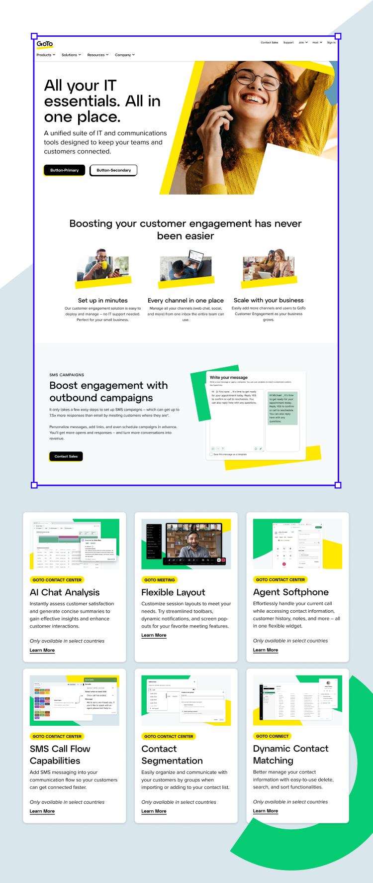
The Challenge It was only in 2022 that LogMeIn became GoTo, and while that change brought in new energy and excitement, there was a lot to do well after the logo switched out. GoTo boasts an impressively large suite of remote support and telecommunications software, and the question was how to sell prospects not just on one product, but multiple products to aid in consolidating their tech stack.
The Solution To do this, I worked with our product marketing team to create new landing pages: promoting new features, integrations, capturing prospect contact information, and driving users from top of funnel experiences down to conversion. One of the biggest efforts was designing our quarterly Release Marketing hubs, where users could dig into details about feature releases across GoTo's product portfolio. For those I would provide the page design, marketing imagery (including blog posts and e-mail collateral), and feature animations.
Read the latest release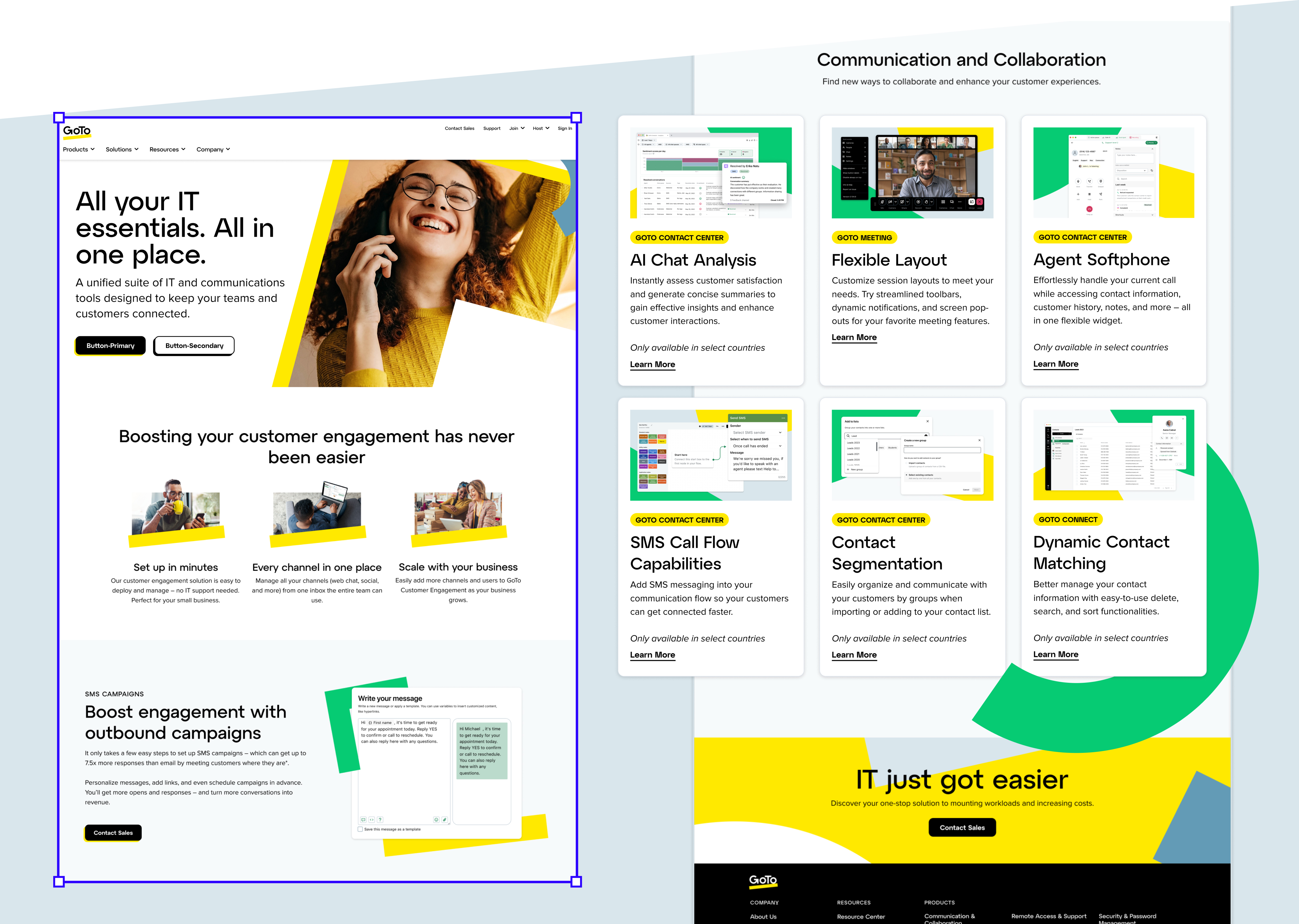

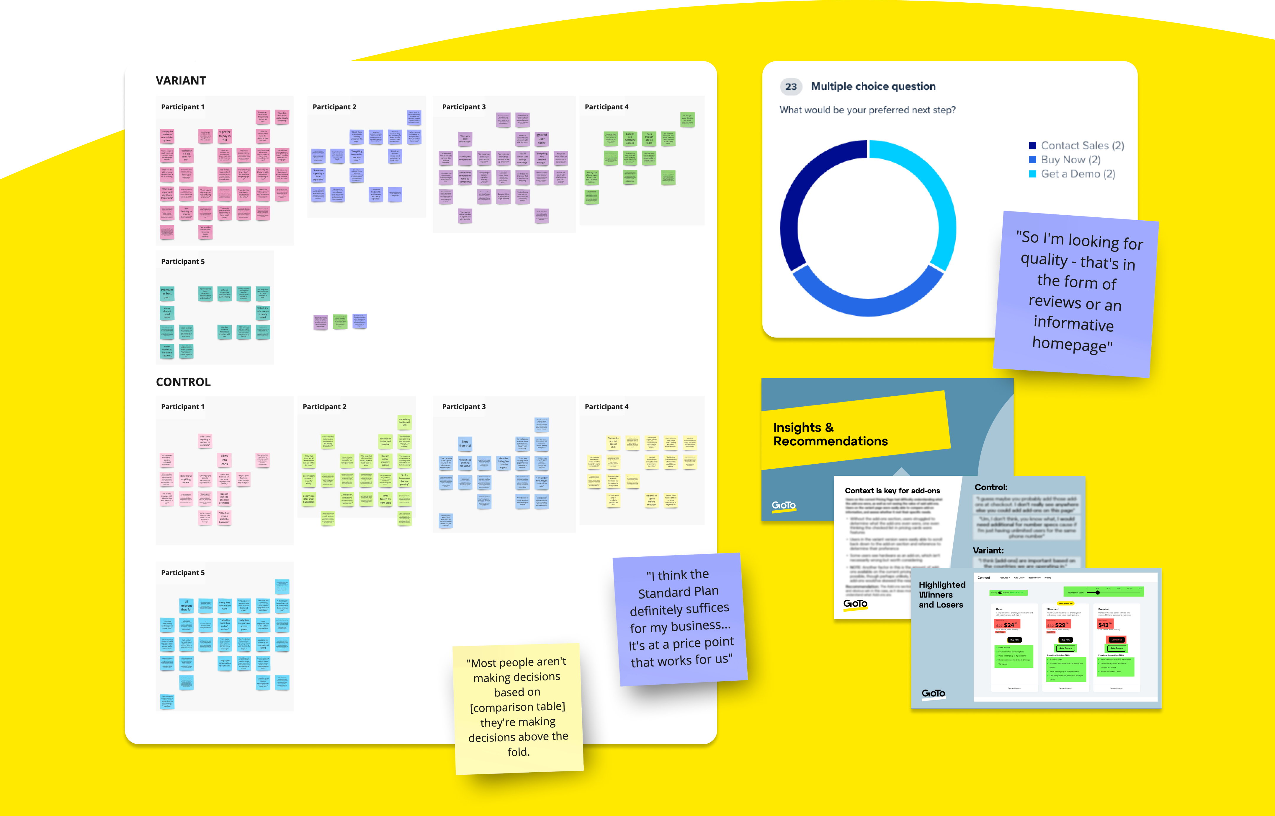
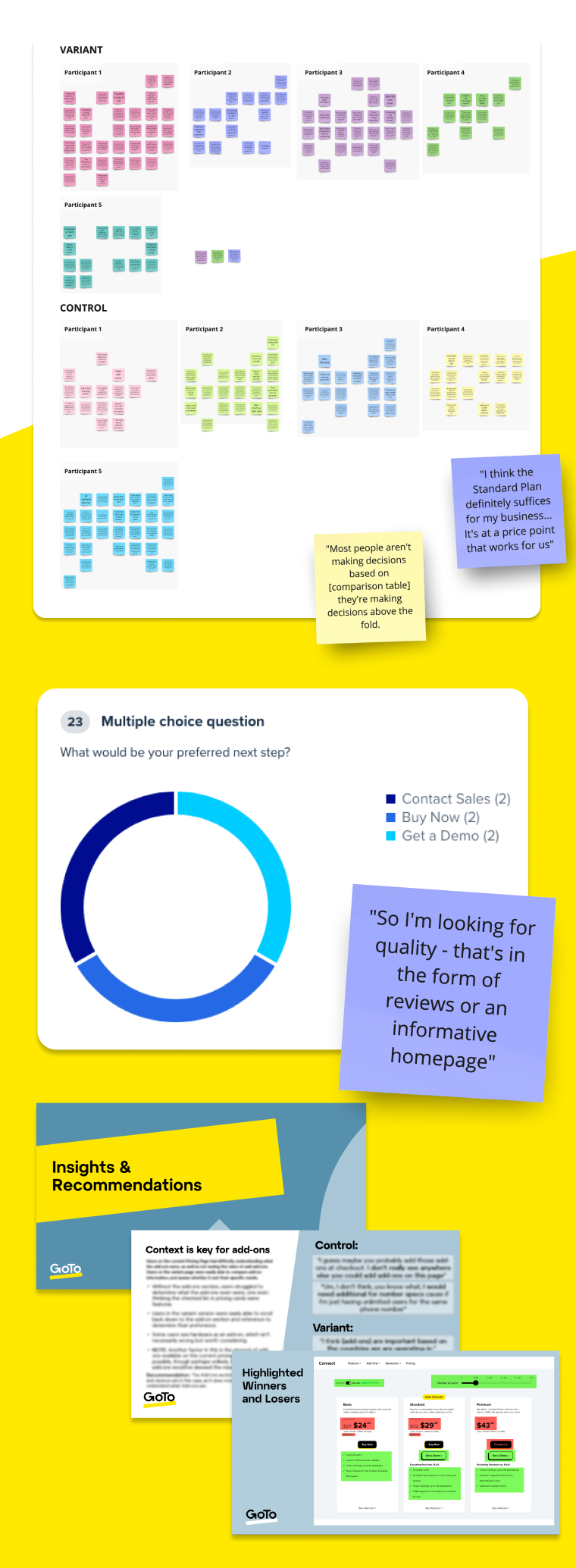
The Challenge GoTo has a very wide customer base, from your local dentist's office to enterprise corporations. And while from a sales perspective that can be seen as a good thing, it becomes a challenge to understand them all and tailor messaging accordingly. To heap onto that, there was a major change in branding which opened up the idea of re-architecting our navigation, IA, and bottom-of-funnel experiences.
The Solution To help hone these strategies, I've lead user testing efforts to understand the attitudes of GoTo current customers and prospects. Some of these tests include general sentiments on product pages, tests against page variants, general marketing messaging tests, and guided pricing page journeys to gauge sentiments and expectations for the user in the bottom of funnel experience.
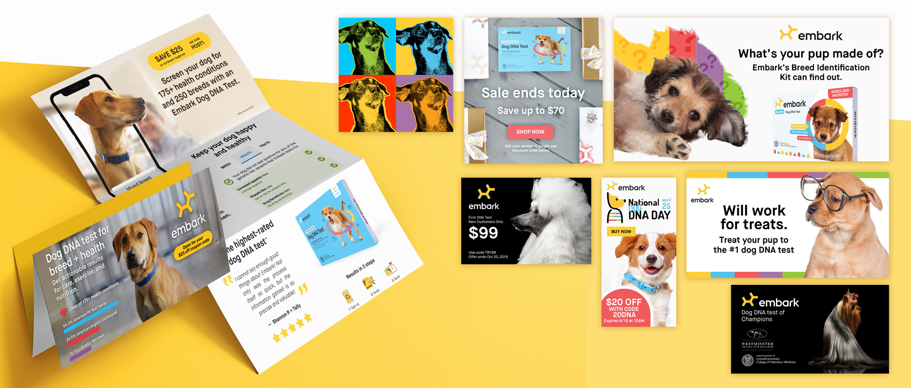
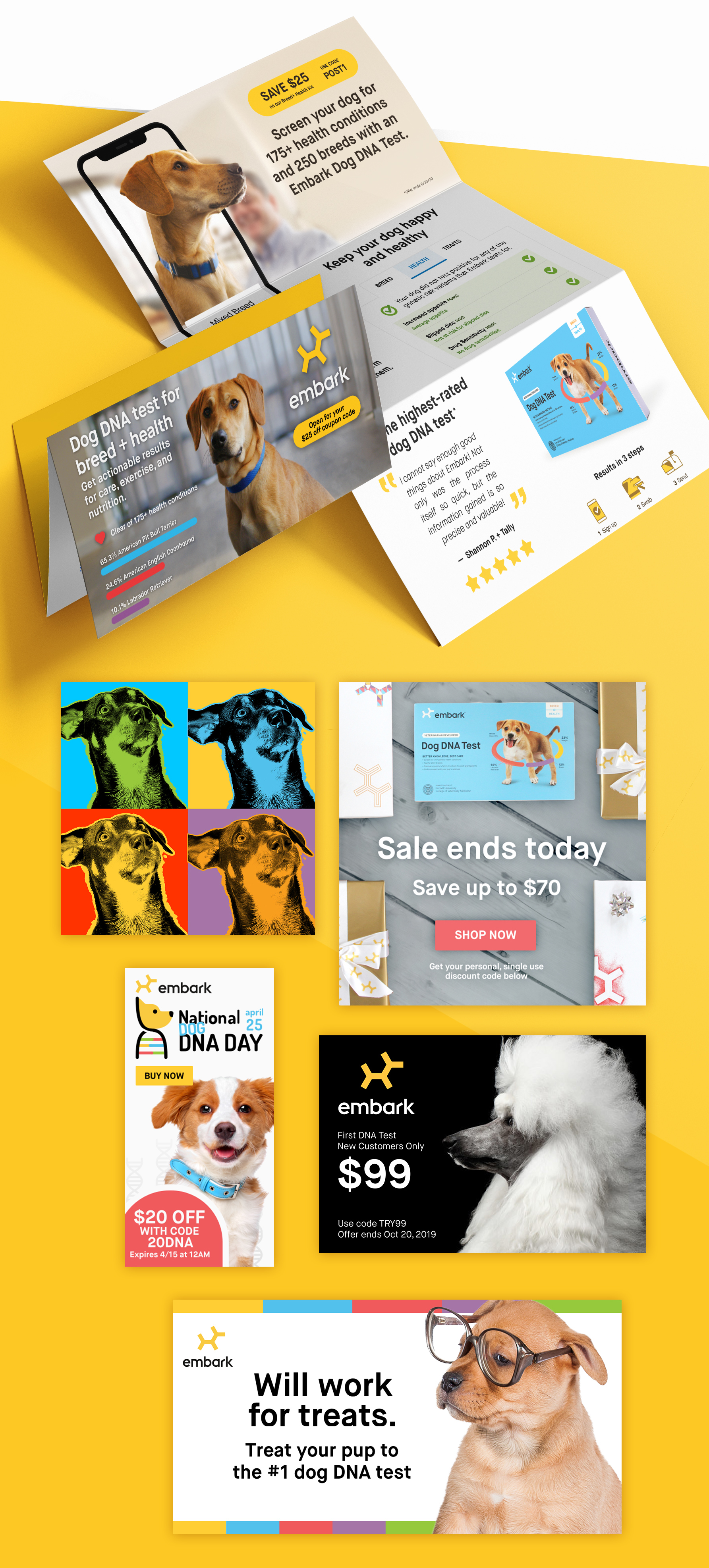
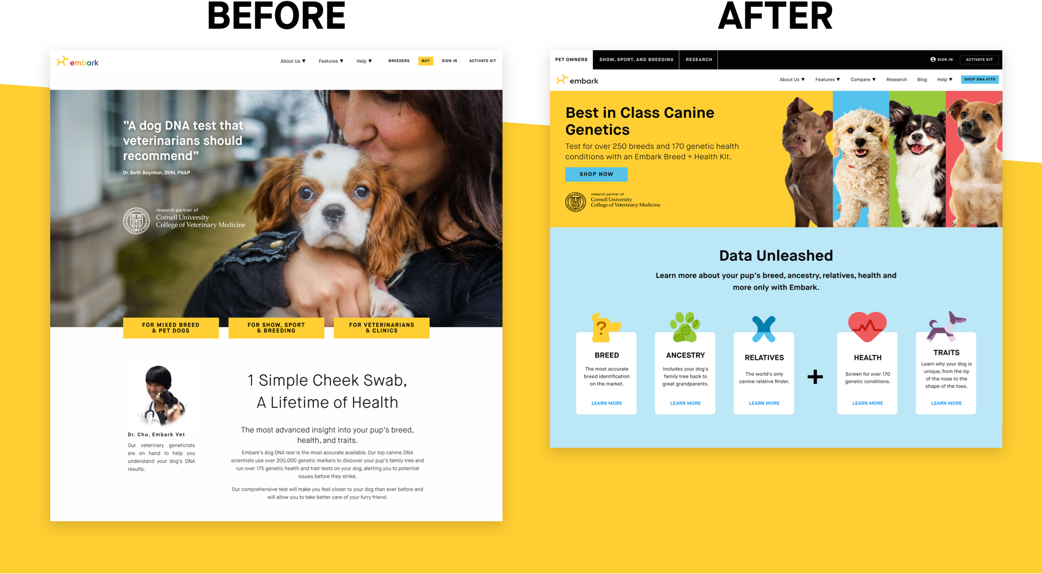
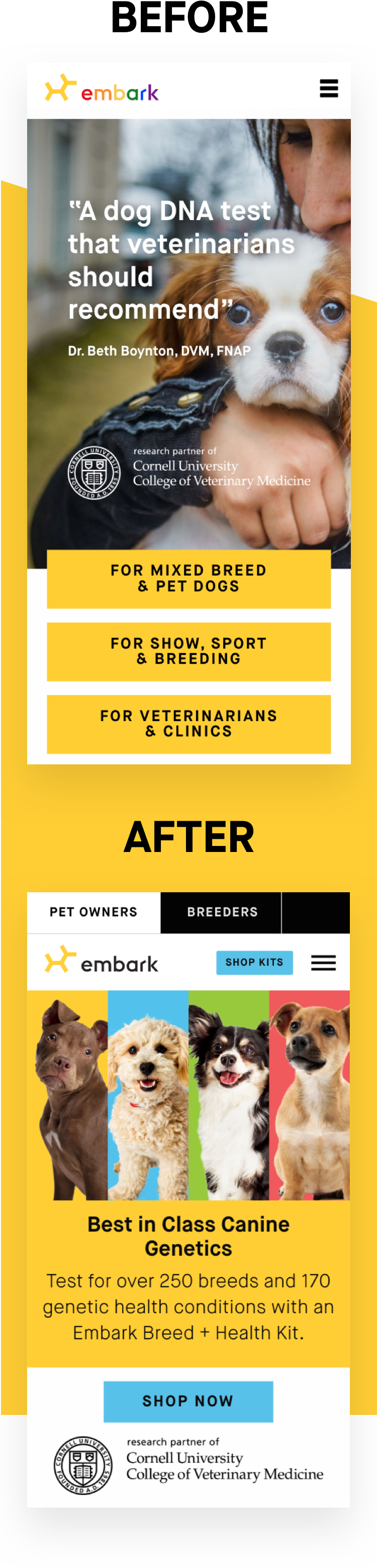
The Challenge Embark is a canine DNA test with the mission of ending preventable disease in dogs. However, despite being the highest quality kit on the market, it wasn't the biggest dog on the block. To be competitive with other Dog DNA tests, it would need constant marketing attention, carefully planned campaigns, and the agility that the larger companies lacked.
The Solution As an employee on the marketing team I leveraged design on digital and print channels – including landing pages, homepage takeovers, paid posts for Facebook and Instagram, direct marketing mailers, commercials for television, and print ads in canine publications such as Canine Chronicle and Showsight Magazine. Campaigns were developed and ran on timelines (sometimes shorter than a week) in order to be responsive to real-time sales metrics. On the side, I acted as support for the post-purchase product experience, designing the UI for new features being rolled out, and finding ways to improve the product experience.
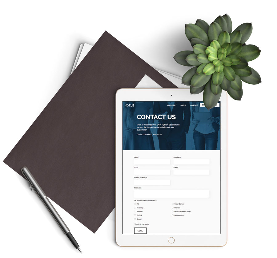
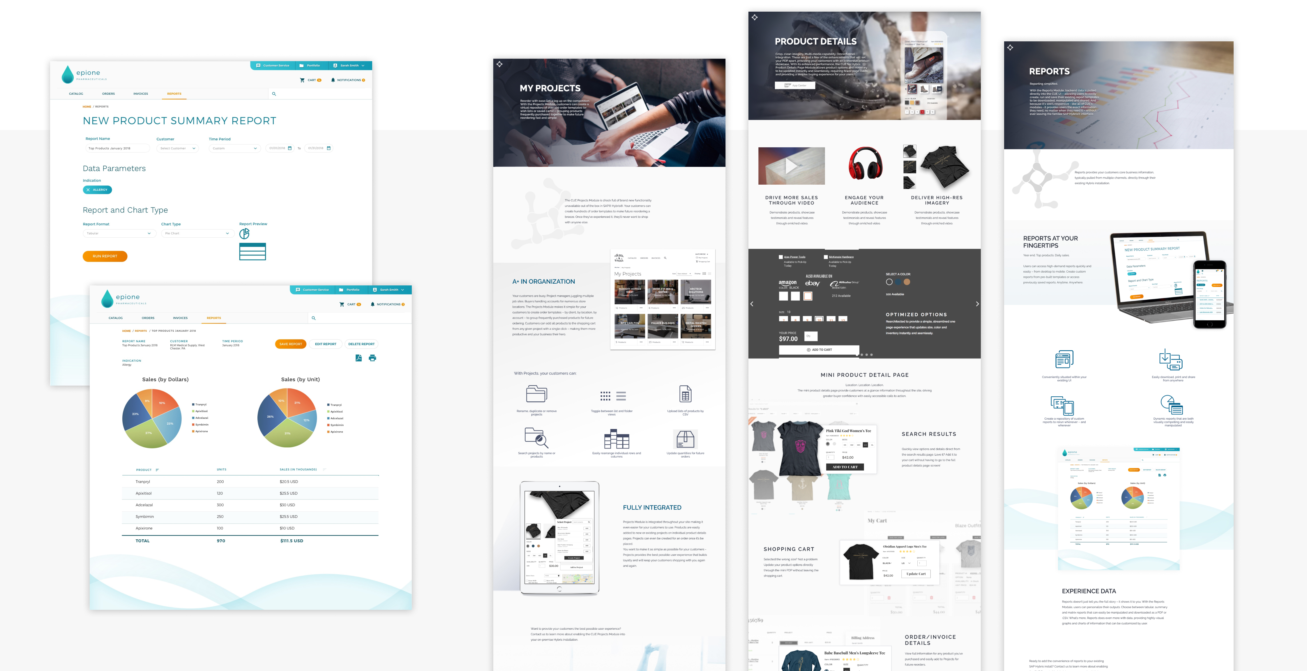
The Challenge CUE, by Excellis Interactive, is a software expansion onto SAP Hybris to expand usability, enhance UI, and add a variety of new features to make e-commerce easier. However, to do so we needed not just examples of what a refreshed eComm website could look like, but a site to promote it all.
The Solution CUE's slick, minimalist branding made a blueprint for the promotional site, a way to mirror how CUE declutters and enhances the SAP Hybris software. Example user interfaces were made for B2B shopfronts across multiple industries, including healthcare and industrial supply. These were made to reflect (while respecting the proprietary information of) brands I had worked with at Excellis, like Pfizer and Grainger.