Summary The Grasshopper rebrand was a chance for me to flex into a UX Lead role, working with our brand and creative team to concept a better Grasshopper brand, pitch it to our CEO, and then spearhead the effort from concept to development. In lock-step with our brand designer's work on display, social, and brand design language I created the initial web concepts, refined them into a final homepage design, and translated that design into a fully fleshed-out component library and digital design system. Even after the design was complete, I maintained a vital role in the rebrand implementation by reviewing and providing QA for our development team.
The State of Grasshopper in 2023
Grasshopper as a product has existed for over two decades, serving as a phone solution for small and micro-businesses throughout the United States. In this time though, it's exchanged hands and leadership many times. The result being a website with more legacy designs and components than new ones.
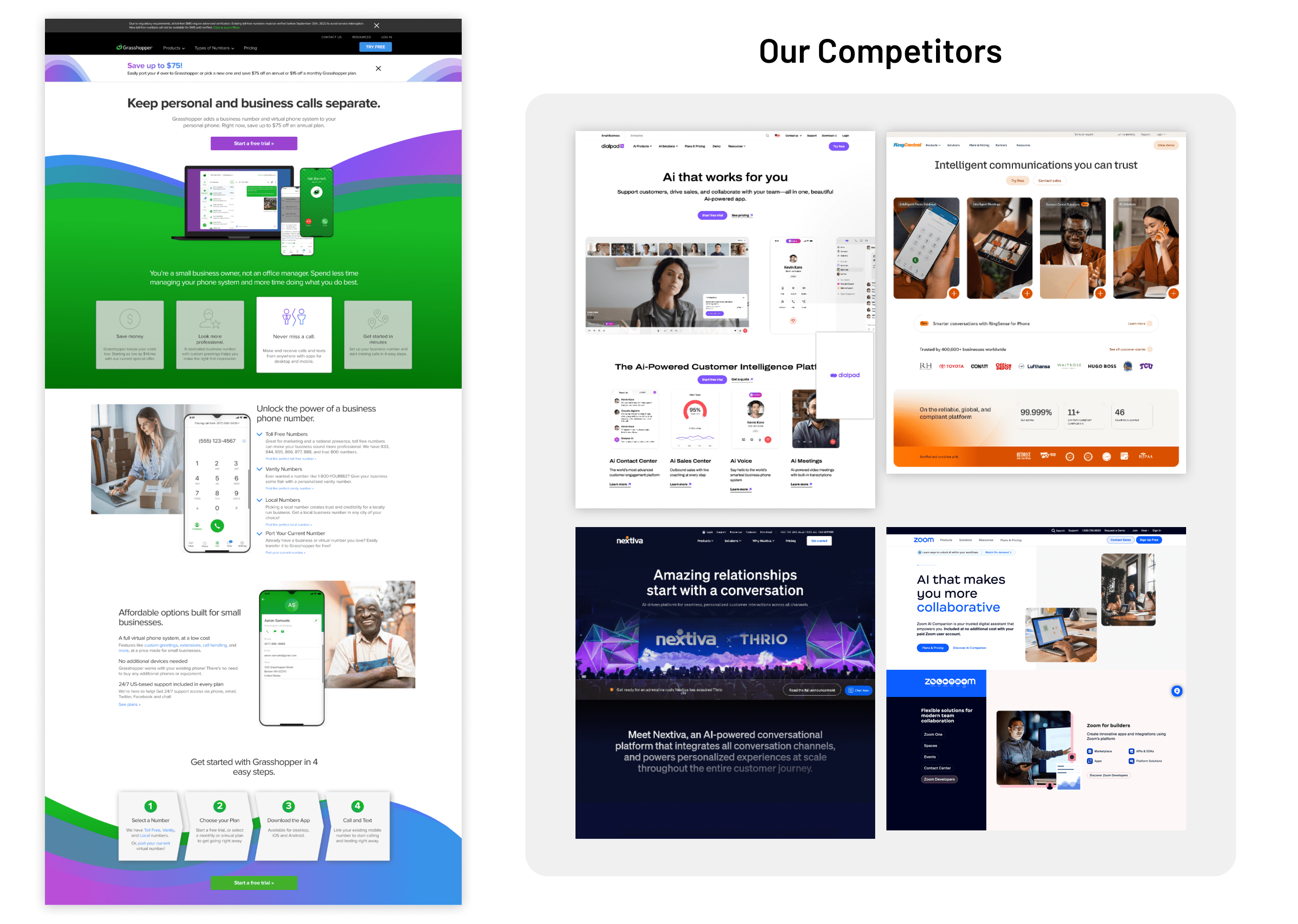
Meanwhile, our competitors have continued to grow with the times, adopting new technologies and growing their branding to match. In comparison to the experiences of other VOIP phone solutions we looked simpler and less expensive, but that also meant we looked antiquated and cheap.
In Q2 2023, during my spare time working for our agile team, I began pitching to Grasshopper's parent company the idea of redesigning the site experience (if not rebranding Grasshopper altogether). While it initially found little traction, myself and GoTo's Creative Director began work on the site, concepting what a better Grasshopper could look like.
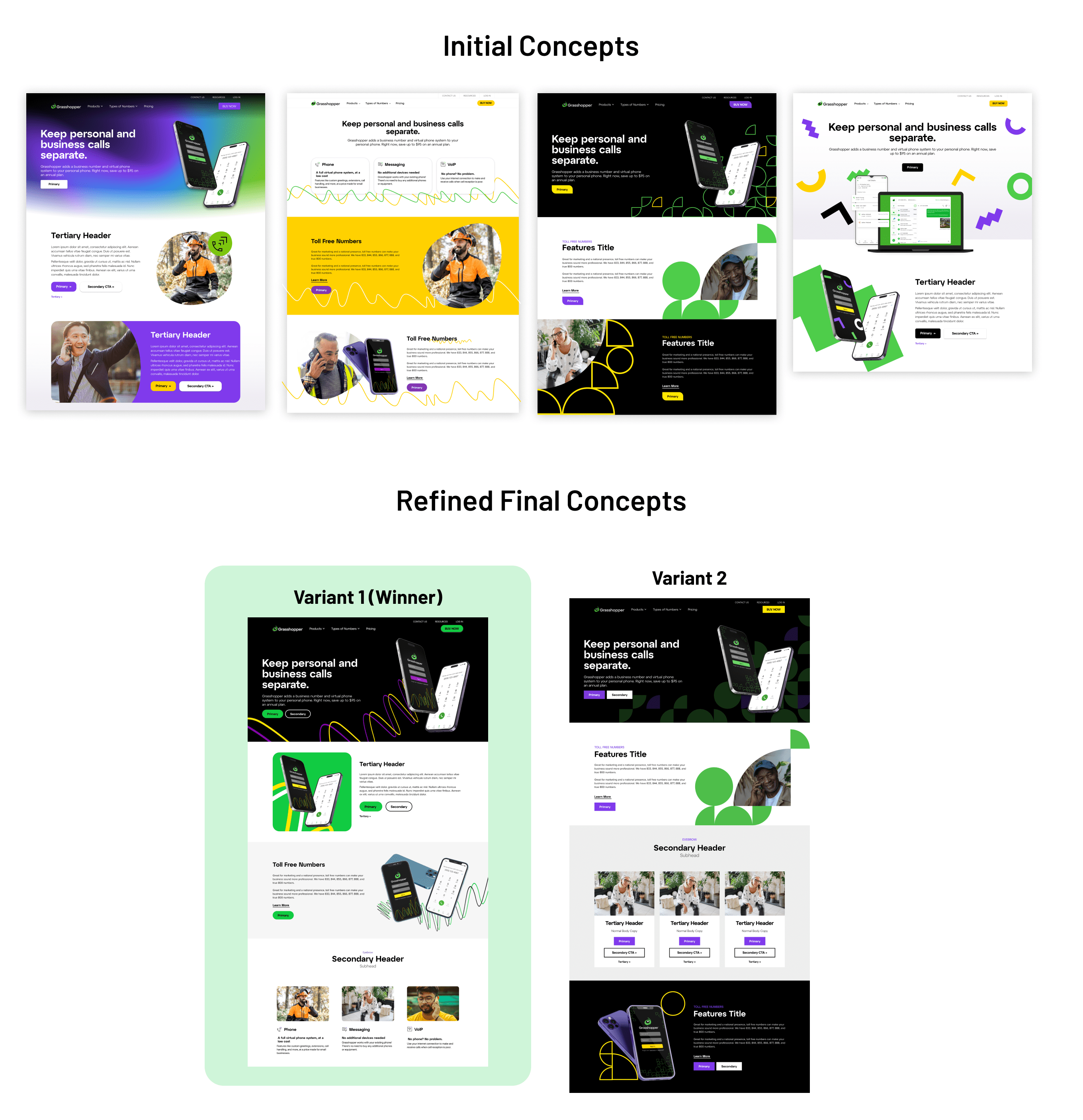
We honed in on the idea of including more high contrast color schemes and the usage of solid black into sections, which set itself apart from our generally lighter and less-premium looking competitors.
Our CEO was a big fan of our first direction, and from there I had my marching orders: overhaul our current component system to match that energy, movement, and modernity from the original pitch work. And push it live by Q1 of 2024.
The Challenge
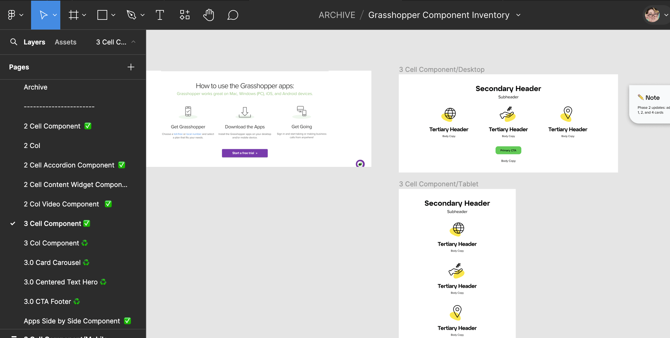
Pitching was one thing, but learning the timeline and the limitations of our CMS was another. Our Sitecore environment was bogged down with many legacy components, some of which only existed on a single page. Not to mention, our MVP due date of January 24th meant that some components would take a greater priority than others. To save our web publishing team and developers labor, I would have to go in and audit each of our identified in use components and assess what improvements were needed, whether those improvements were a priority for MVP delivery, and whether a component could simply be swapped out for another that was already being redesigned.
The Redesign
Once the initial scoping was done, it was time to lay out our plan. We created an initial homepage design, whose components were considered MVP deliverables and would take priority in the development and publishing schedule.
This allowed development to start work concurrent with the second leg of the design task: designing the rest of the major components. I made what was colloquially called the "secondary page", but was in actuality page collaged out of all the rest of our high-impact components not slated to be phased out.
With this completed, I was finally able to change into a different hat: one of a design director and QA provider. I worked closely with our developers, speaking with them frequently to discuss the finer points of the components, pointing out any inconsistencies with the final design, and giving approval before it could move on to backend development.
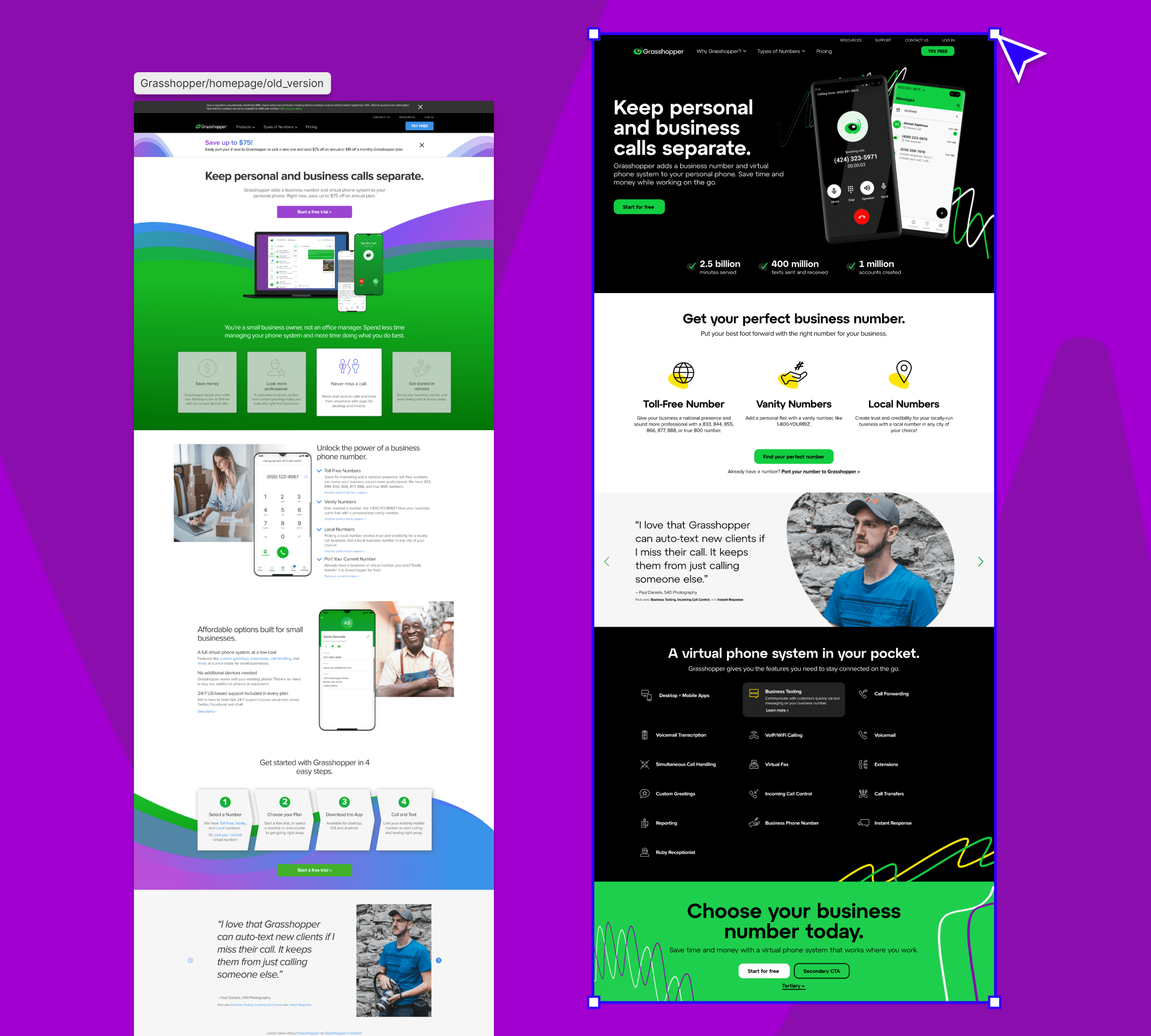
Depending on the time you read this, you may notice that the homepage design does not fully match one of the images seen above. This is because the quick turnaround has resulted in a phased rollout approach, which means it may not be completely implemented until the end of Q1. However, I had that in mind as well, and made sure to lay good foundations.
These design foundations covered all of the basic attributes of Grasshopper's revamped design system, to assure that even at the time of my departure there are thorough guardrails for buttons, page typography, iconography, and graphics. Special care was given to the design of each to make sure colors and behaviors were accessible and AA compliant.

Conclusions
While it may be too soon to tell at the writing of this to measure the full impact of the rebrand, this has been one of my strongest cases of demonstrating UX leadership in a company. I worked not only to deliver the items needed for sprint periods, but collaborated outside across departments to imagine a better web experience. Too often we can be caught up in the hustle of sprints, and forget about our aspirations and ideas on how to improve a product.
My start as a brand advocate evolved into becoming a brand leader for the new Grasshopper, and gave me opportunities to work with any individuals I don't meet within my usual team structure. It gave me the opportunity to be freely creative, then the challenge of making that creativity work within the constraints of our timeline and our CMS challenges.