SummaryWhen LastPass was due for a site overhaul I took it as an opportunity to learn more about our business and consumer customers, and structure the IA based around their expectations and priorities. This involved running two user tests: one card sort to understand what features users from either business segment prioritized, and then a second card sort to see how users would group those navigation items together.
The Challenge
LastPass in 2021 was a rapidly growing product: new features, pages, and resources were constantly being rolled out. However, the site navigation in place was not built to scale – especially the footer. The footer suffered by having too much content with too little hierarchy, with non-essential sections being given equal weight and placement in the footer as the pages users were usually looking for. To add onto it all, LastPass was on the cusp of a rebrand. If there was time for a new IA, I knew it was right then and there.

Understanding a growing customer base
Due to LastPass' rapid growth we had new motivation to learn more about our customers and put some data-backed decision making into our design.
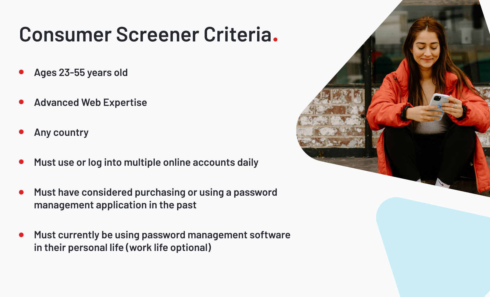
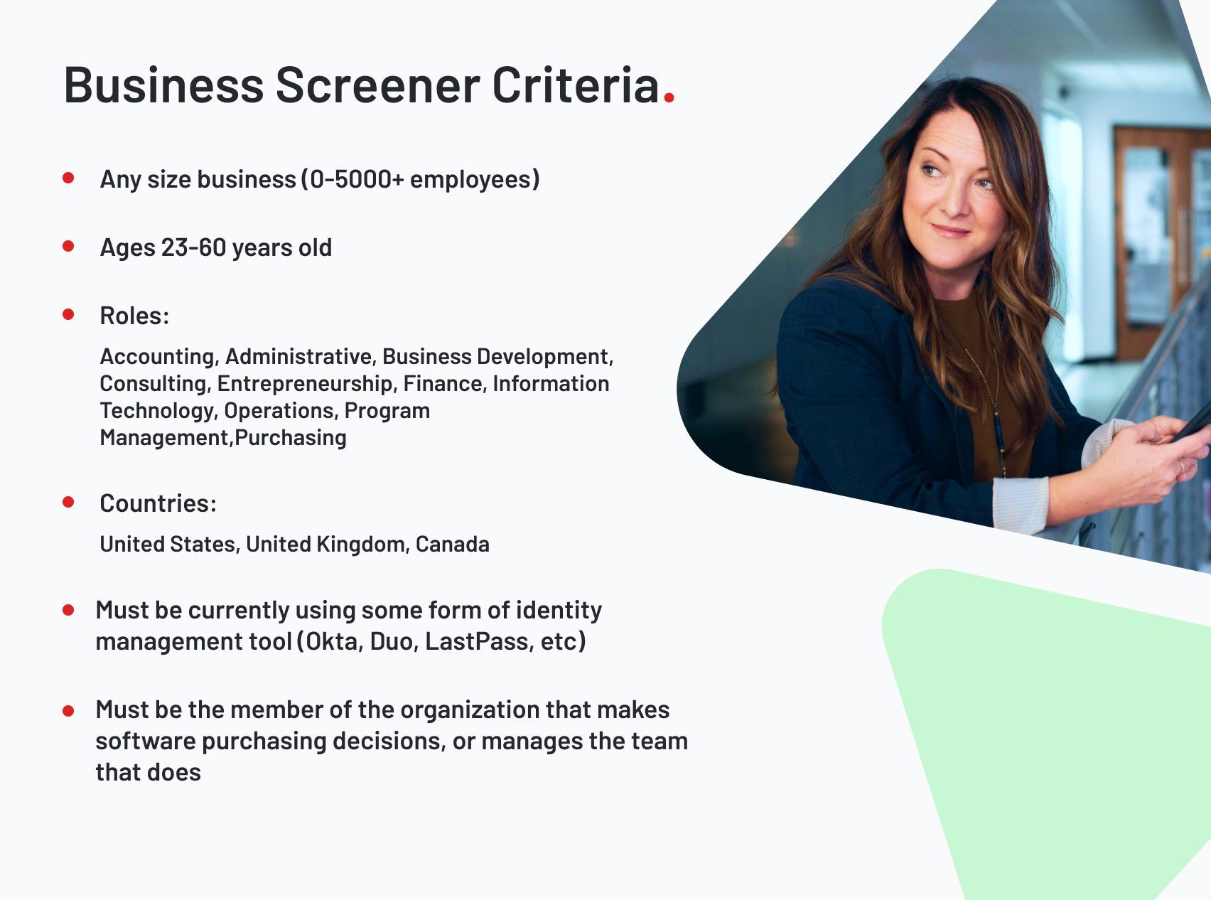
Particularly, we needed a baseline understanding of what a person is looking for in password management software and which of our offerings is most valuable to them. So we began to build a profile of what a potential LastPass customer or current user could look like for our two business segments: our consumer and business customers.
An interesting factor of this was deciding that any user being screened should already be using some kind of password or identity management tool. Our rationale was any user looking for a password manager separate from their browser's built-in functionality has some degree of tech savvy, and are likelier to shop around and compare products.
The Prioritization Sort
Next we stood up an unmoderated closed category card sort, conducted on Optimal Workshop and recorded on UserTesting to get verbal feedback. Tests were divided into a consumer and business version: the business test would sort a deck containing descriptions of all of the pages in our IA at the time (42 total). The consumer deck by contrast would exclude cards of any affiliate, business, or enterprise targeted pages (22 total).
Cards would contain the description of the navigation item, which they would categorize from Very Important to Not at all Important, each with a maximum number of cards that could be put in each (5 for Consumer, 9 for Business). Once they were categorized, the user was given the additional task of ranking those cards inside of each category as well, from most to least important.
Initial Takeaways
1. Our copy was failing to get users to the pages they wanted to see.
- The results of the card sort had a clear disconnect from the click data we had gathered prior to testing.
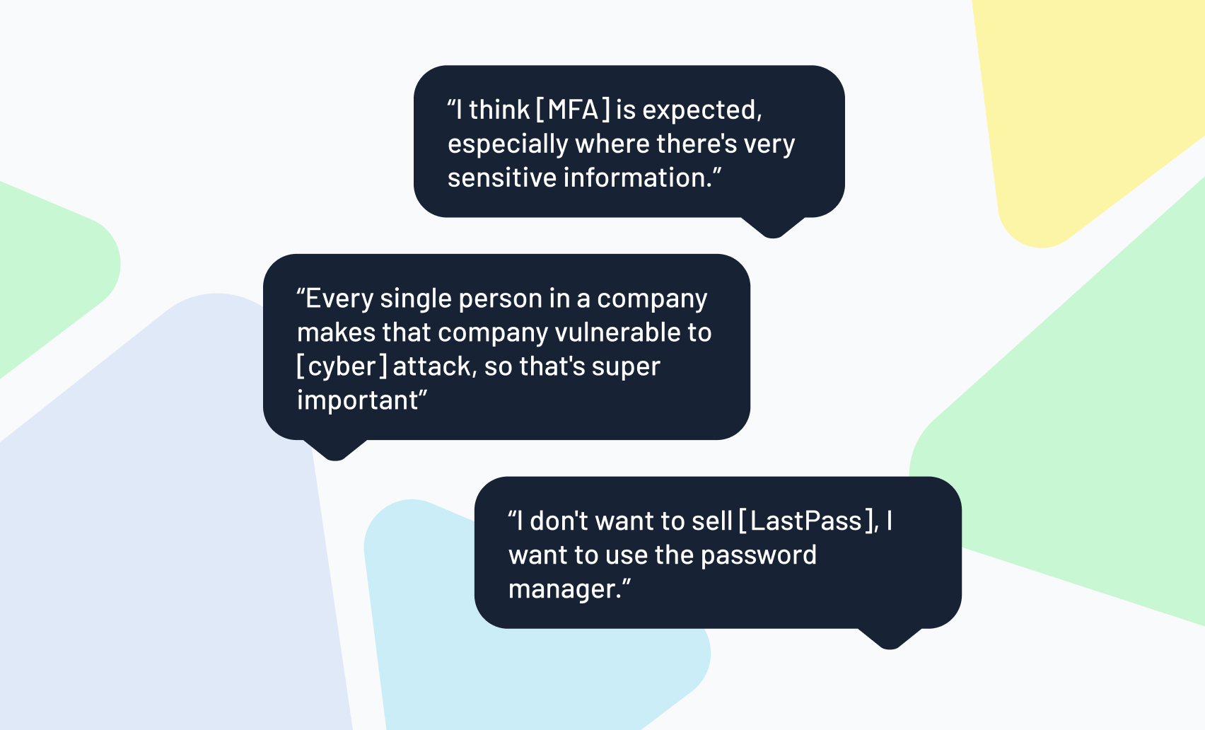
- Both consumer and business users favored safety features above all others, despite most of these safety features performing poorly on the live site.
- This could've indicated a need to change our phrasing for items, or a need for further context beneath those items in our header navigation.
2. Our footer was too cluttered.
- It became apparent that some of our footer categories could use a serious culling and reorganization
- The About Us section was taking up a fifth of the footers real estate despite users placing our careers, webinars, and about pages overwhelmingly in the Not at all Important category.
- Our split of the business column into Business and Enterprise sections came off as unnecessary, especially at the top of funnel where users weren't ready to compare plans yet.
3. Business and Consumer customers mostly want the same things.
- Another blind spot we realized was Business and Consumer customers had very similar priorities
- This is despite the fact that Business customers in the test had nearly double the cards.
- The message was clear: Businesses put our password vault features first, and any other identity management tools came in second.
- Because of that, we'd have to swap our Features and Business columns so users scanning the footer left to right would see features first.
- Our partner program links were also extremely unpopular with both segments.
4. We were missing some serious marketing opportunities.
- The implications of these initial results were actually reaching beyond just opportunities to improve our UX.
- For example, there were features that were ranked high priority that LastPass had never run any sort of paid search or ads on.
- By better understanding our customer bases we were actually uncovering marketing blind spots as well.
The Categorization Sort
Our next step of the testing put our customers in the drivers seat: asking them to group these navigation items themselves. These would not be reflective of the final layout necessarily, but we wanted to further identify blind spots and friction in the user's understanding of our product offerings.
To do this, we got an entirely new group of consumer and business prospects and gave them an unmoderated cart sort, recording them on UserTesting just like last time. Using the information from our priority sort (and similarity of Business and Consumer results), we were also able to reduce the number of cards that required testing and gave that deck to both consumer and business audiences. Some of the items removed would go on to be removed from the navigation as a whole.
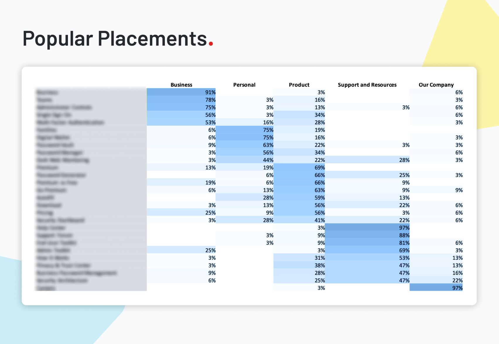
Users were given six categories based on what we thought the new footer categories should be: Business, Personal, Product, Support & Resources, and Our Company. Once users sorted the navigation items into those categories, we asked them to rank the importance of those items in their categories. This time there were no maximums or minimums on how many could be in a category.
Categorization Takeaways
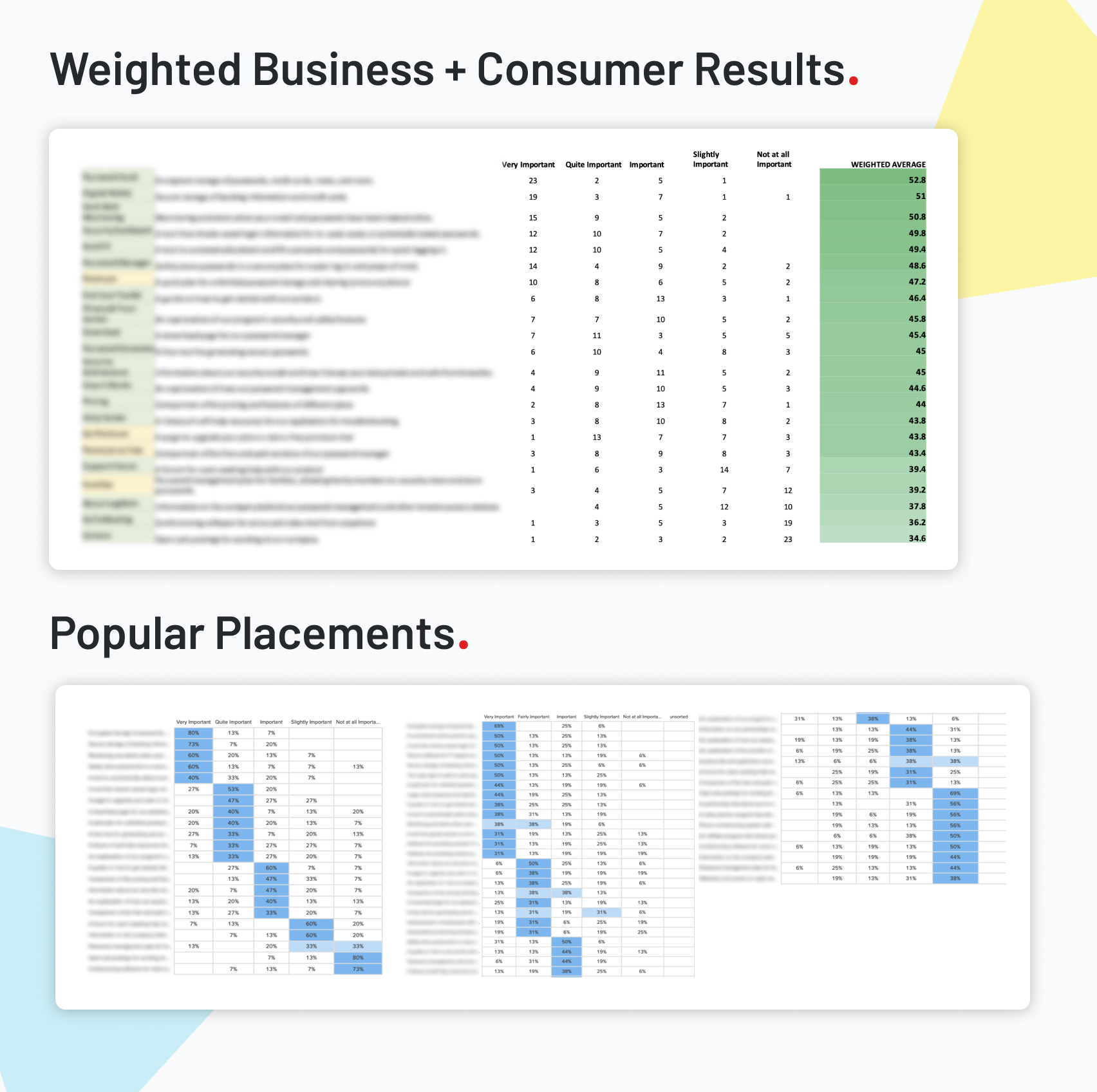
1. Business and Consumer audiences made groupings near identically.
- We were able to see again that Consumer and Business prospects had very similar perspectives on LastPass' product offerings.
- To emphasize this, we aggregated the results into one single table showing the popular placements.
2. Product is too vague of a footer category.
- To be frank, the simple and broad terminology of Product was making things less clear, not more.
- Users started to use Product as a catchall during the sort: placing any technical terminology they didn't understand into Product category.
- It was clear the section would be much better serviced by giving it an easily understandable label like Features.
3. People don't understand Our Company
- Only one link in the entire deck was sorted by a majority into the Our Company category, and that was Careers with a 97%.
- Almost everything else company relevant was instead put into Support & Resources.
- It seems clear that Our Company as a section needed to stay small and out of the way.
4. High priority pages from the last sort were mosty put into Personal or Product
- This is just another piece of supporting evidence that Business and Consumer audiences want mostly the same experience.
- Items like the Password Vault, Dark Web Monitoring, and Digital Wallet are things users want to read about first, and any navigation would need to be prioritized that way.
Conclusions
From here we had a much clearer idea of both what LastPass prospects wanted, but also in what our current weaknesses were. For one, we spent so much investing in our new Business offerings that we didn't realize those customers cared for mostly the same things that Consumers did. We also overinvested into our partners program, which prospects overwhelmingly didn't want to hear about.
That being said, we did discover our strengths too: LastPass' core features resonated strongly with both Consumer and Business prospects, and justified having an even heavier emphasis in our IA than it currently did. There was great potential to start running ads on features that real prospects were putting first, and we had the data to back that up.
This study opened the door to a new structure for the IA, one that could change not just the footer but navigation as well (which had just been updated months prior). LastPass could now step into its rebrand with a better understanding not only of its customers, but a better understanding of itself.