Summary
The Challenge
In 2020, the pet industry saw unprecedented level of profit and growth. Pet adoption had increased dramatically during quarantine, and stimulus checks gave savvy pet owners the means to go the extra mile protecting their new member of the family. This wave lifted brands like Embrace Pet Insurance and revitalized the digital marketplace for pet insurance as a whole; with a groundswell under acquisition through e-commerce, as opposed to traditional phone sales.
However, with each high tide comes a low one, and as the economy in 2023 and 2024 began to retract so did pet insurance profits. This became a pressure test for its pricing models and e-commerce experience. Users were getting more discerning when it came to which brands they trusted, and increasingly sensitive to price weighed against perceived value. This created a delicate ecosystem for Embrace where any point increase in conversion matters.
Meet the Pet Parents
In order to craft a better experience for prospective customers, first we would need to understand what was meeting their needs and what was falling short. To do this, I created unmoderated user tests on UserTesting.com to survey prospects as they went through the insurance quoting process.
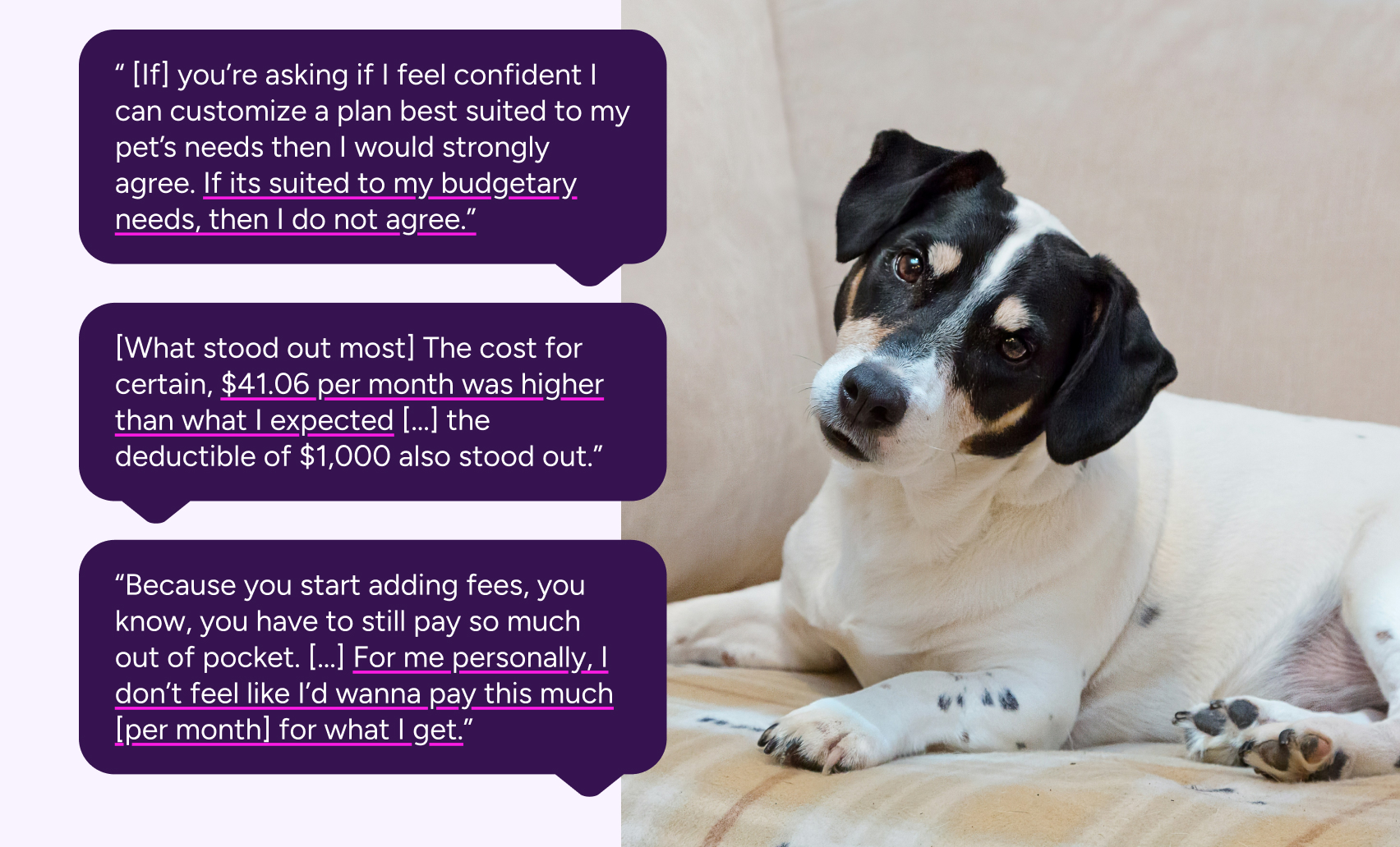
The picture of the average pet insurance customer was becoming clear. These prospects were shrewd: they were financially literate and thought through each step with a budgetary lens. A number of them weighed the cost of insurance versus a high yield savings account, and others would calculate the annual cost and compare it to current budgets set for their pets. All of them were eager to experiment with customization of the plan, as opposed to opting for the preselected plan. Then they would create an expensive, low-deductible plan and walk their way down to a price they were comfortable with. However, some weren't comfortable with any plan price at all.
Our standout issue was the lack of clarity on our plans and how they worked. If a user arrives at the quote engine as their first entry into the marketing funnel, they had close to no context on what a pet insurance plan was. There was confusion on whether it functioned like health insurance, or whether they had to pick veterinarians in network. They also expressed confusion over our Wellness Plans (which functions similarly to a Health Savings Account.)
Overall, what all users wanted was value. While rising veterinary costs made rates hard to lower, there was untapped potential in further educating the user of why a pet insurance plan was was a better value than plain savings. We needed to market pet insurance better as a product for peace-of-mind, that enabled pet parents to better take control of their pet's healthcare and to no longer put off vet visits out of fear of cost.
The Big Swing: Good Better Best
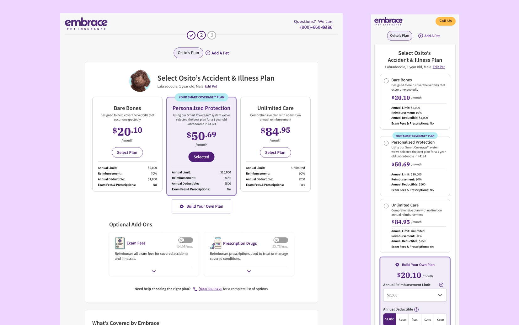
While we started right away on our smaller A/B tests, we had a much larger experiment brewing in the background. When testing users at the beginning of this roadmap, we noted how users were eager to customize, but customization was the only option that they had. This required the user to be educated about insurance up front, and able to interpret the configurations of the insurance plan into concrete value. As a result users were much more cognizant of monthly cost than any other factor of insurance.
To reframe the user's thinking on insurance plans, we wanted to give three much more contextualized plans for a user to potentially select: a budget plan, our recommended plan, and a premium plan. Underneath, users would still have an option to customize their own plan. Our hypothesis? Giving users a spread of options will allow the user to better understand the correlation between coverage and cost. Having these options up-front would also reduce choice paralysis and cognitive load. Users will use this to either select one of our better or best plans, or customize one that is higher than the plan they would customize in the control.
Unexpected Headwinds
Things did not necessarily go according to plan. First, our A/B testing platform was bugged, and thus the test went live without a control version. Our launch over the Memorial Day weekend also caused a stir amongst affiliates, and due to the holiday it was difficult to tell whether the downturn in conversion rate was due to the new page layout or simply because users were not online making financial commitments like pet insurance on a holiday weekend. In the end, the combination of factors led us to withdraw the change, regroup, and study what little data we had.
The prognosis was mixed and most importantly not statistically significant. We did note a large decline in mobile sales that were far too unusual to just be a holiday dip in purchases. If we were going to launch again, we decided it had to be with the improved mobile experience.
On top of that, there were concerns that the gaps in price between our plans were too large, something that would take significant consulting with marketing and sales, plus a more sophisticated backend process for selecting said plans.
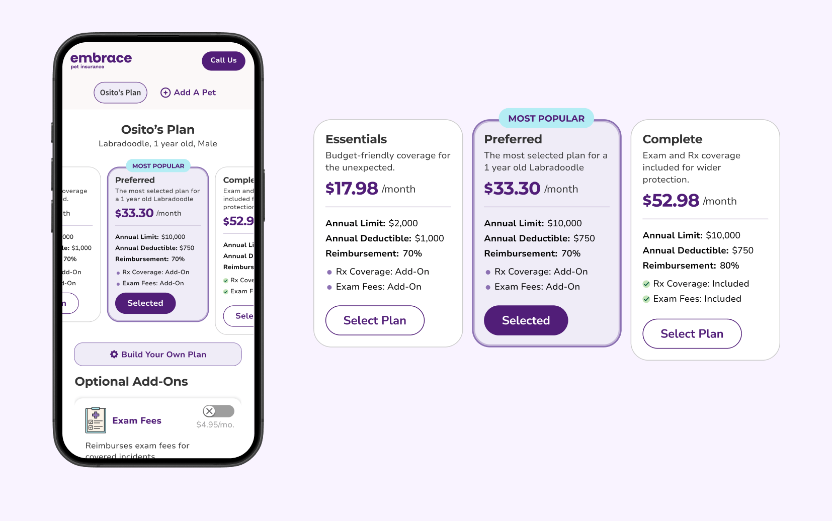
We launched several months later, after our developer team created a new internal tool for A/B testing to replace our vendor platform at the time. With this, the A/B test had greater integration with tracking tools like PowerBI, and allowed us to analyze data at a much more granular level. Launching the test in September, we were able to run it for a full month until it reached statistical significance.
This painted ultimately a more complex picture: conversion rate was down .3% on the variant, but premiums rose 7.5%. Additionally, most of the .3% lost was still being lost on the mobile version of the variant, with desktop versions only having a .1% difference. We were making more profit from the variant version, and would simply need to find the right angle to retain that profit advantage with an equivalent or greater conversion rate to the control.
What we learned
UX rule of thumb tells you that the loser in an A/B test is exactly that: a loser. Conversion is king in eCommerce, and the key indicator of a site's value. But myself and the rest of the customer experience team saw something in that test: something that could help us better understand our users. A/B testing isn't just about picking the biggest number: its about understanding the user, and through that better understanding our product.
This losing test had clear impact on users: those who did convert were converting at higher annual costs. Something in the design was cracking that presumed unbreakable ceiling called price sensitivity. If we can find that special something, isolate it, and bring it back into the winning formula, or better yet bridge the conversion gap between the control and Good Better Best, we could have a bulwark against increasing economic headwinds. What we gained from this test wasn't measured in profit, but in potential.
A Moment for the Small Victories
The story of our Good Better Best doesn't tell the whole story of Embrace's CRO journey: the test takes place in the middle of a rigorous A/B testing schedule that started in Q3 2024 all the way to Q4 2025. And all throughout, we were making incremental gains on our conversion and month-over-month profits. While small individually, these add up to wins that accumulated over time to make a noticeable impact.
Enhanced Quote Engine Framework
Hypothesis:By contextualizing information and leveraging more hierarchy, users will be able to better navigate the Quote Engine experience, lifting overall conversion.
Result: 1.4 point lift in conversion rate month-over-month, .4 lift in multi-pet policies, and 1.7 point lift in Wellness take rate
Quote Engine Discount Labeling
Hypothesis:Using common UI language to call out savings such as multi-pet and military discounts, users will feel like they are getting a greater value and are likelier to purchase.
Result: These value indicators resonated with users, resulting in a .6 point lift in D2C conversion month-over-month.
Wellness Opt-In Module
Hypothesis: By building upon our gains from the Enhanced Quote Engine test, we decided to experiment more with an entirely different Wellness Opt-In module than our toggle approach.
Result: Users responded positively to the new checkmarks, as well as moving coverage out of the module and replacing it with the values the Wellness plan provides. Overall, it decreased visual noise and made users more confident understanding the plan's offerings.
Total Wins: +.5 average lift in CVR, +.4 YoY lift in pets per policy, +4.0 YoY lift in Wellness take rate
Conclusions
A/B testing is simple on its face: pit multiple pages against another and pick the winner. But that doesn't tell the whole story. Each A/B test is about learnings: what you learned before that created this test, the research that goes into making it, and what you've learned when its all over. Sometimes our biggest wins were our smallest changes, like changing the page 1 form into a single column, which provided a nearly 22% uplift in conversion. But those aren't the ones we learn from the most.
I hesitate to call Good Better Best a failure, because we gained a wealth of knowledge through creating it. As of now the team is still keying in on how to break through price sensitivity as dramatically as it did, and we all learned about the value of cross-team collaboration. But most importantly everyone across the teams learned not to throw in the towel after the first bout.
They say pain is the greatest teacher of all. There was a lot of pain and struggle to get Good Better Best in flight: from the aborted initial launch, to the long road to relaunch the test, to all the small adjustments that were made frontend and backend just to see if the needle moved. The improvement from the May launch to the August launch on mobile taught about economy of space and communicating more information with less. Changes to the tier copy taught us to keep language simple and avoid sales-y jargon. Lastly, pricing adjustments taught us to be more sophisticated in how to reach our pet parents; opening the door for quotes even more customized to an individual pet's needs than ever before.
Overall Good Better Best is a deceptive success story: a story on how to push the limits of a test, how to keep learning, and how to not shrink away in the face of failure. There'll always be a test that doesn't go the way you hoped, but in those failures there are seeds for business, personal, and professional growth.